Spontivly
Analytics dashboards for non-technical users
Overview
In 2023, I joined Spontivly as the only designer at a venture-backed startup focused on democratizing analytics dashboards. I also took on PM responsibilities: working directly with cofounders to understand vision and business goals, partnering with the head of engineering to prioritize and roadmap features, and regularly joining sales calls and talking to customers to inform product direction.
- Adopted by professional sports teams including the Tampa Bay Rowdies
- Used by Carta and other notable B2B companies for stakeholder reporting
- Unified fragmented brand identity across marketing site and core platform
120+ APIs supported
Over 120 API integrations supported in the newly designed platform
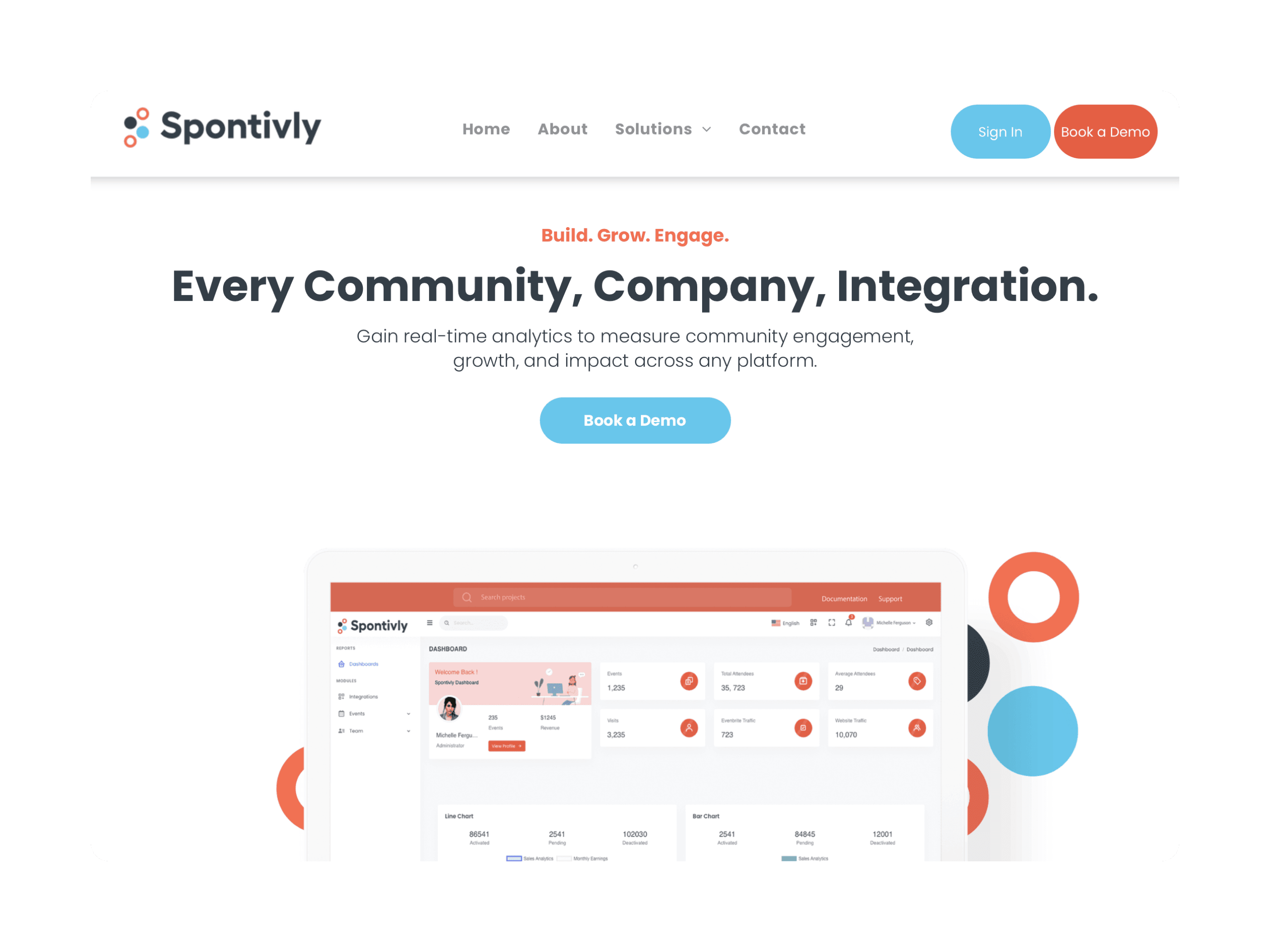
Full website redesign
Relaunched marketing website 1 month ahead of schedule, doubling inbound leads
Powered 90%+ of sales demos
Interactive prototypes I created to personalize demos to each prospect's brand
Website Redesign
My first project at Spontivly was redesigning the marketing website to drive more leads and establish a consistent brand voice. The brand was fragmented, so this redesign extended beyond the site to the core platform's visual identity. I managed the project end-to-end: scoping with marketing and founders, designing the system, advocating for an accessible CMS so anyone could manage content, then hiring and leading engineers to build it. We launched over a month ahead of schedule and doubled inbound leads.
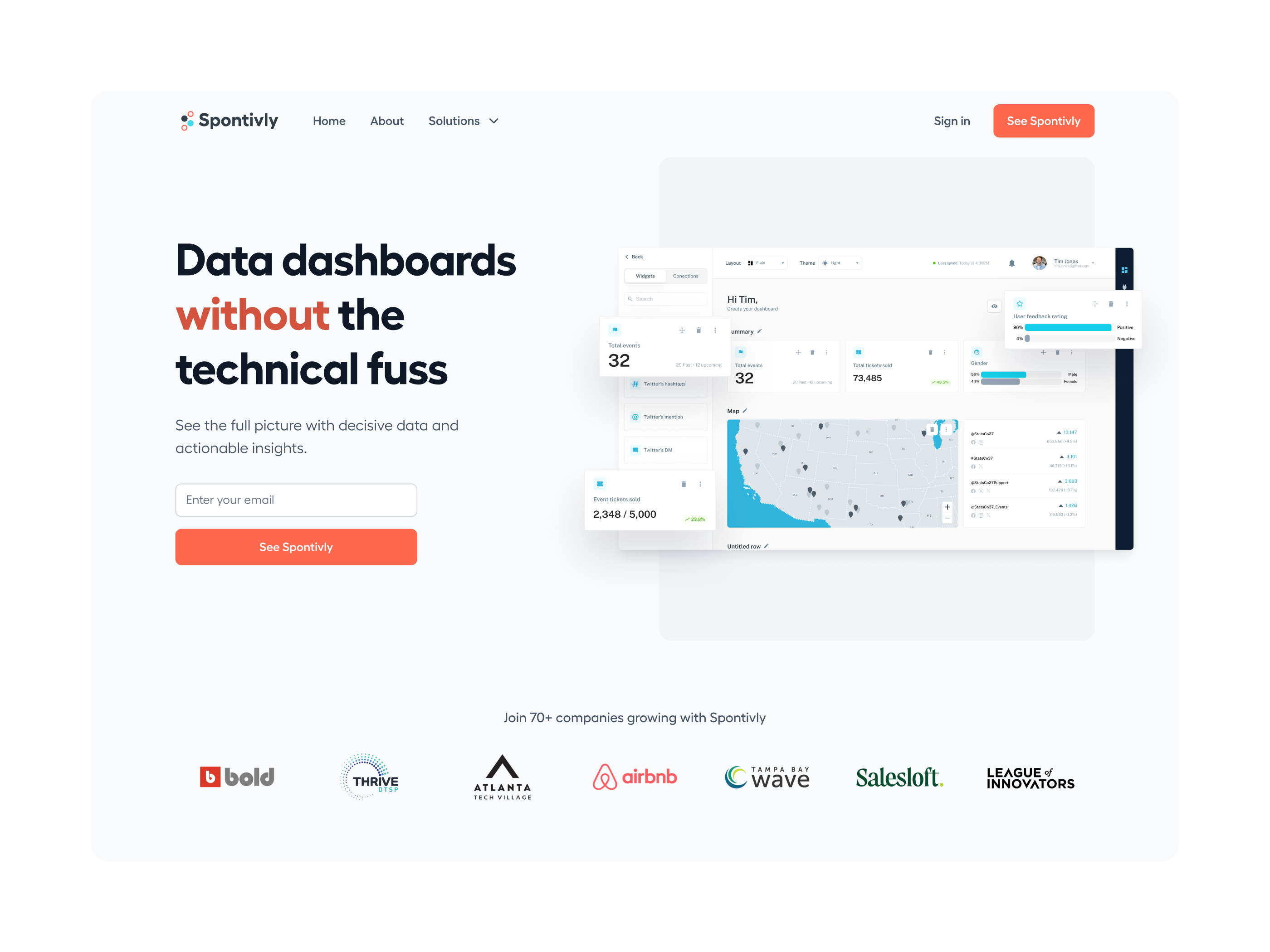
Dashboard Builder
I led the design of the analytics dashboard builder and an admin dashboard for managing user-created dashboards and permissions. The goal was to enable users to connect any API from social media, CRMs, and more and customize the generated charts and tables in a drag-and-drop builder. I collaborated closely with marketing, engineering, and co-founders to understand our users and their varied goals, from providing stakeholder reports to making data-driven decisions. I tried to steer the design toward something that felt familiar while still incorporating all of the features that make Spontivly a unique platform for data analysis.
I was regularly on sales calls and talking directly to customers, which meant I had a clear view of what users actually needed. The biggest challenge was managing outsized demand against a small engineering team. Not everything could ship immediately, so I worked with the engineering lead to prioritize ruthlessly and helped stakeholders understand constraints and timelines.
Chart Customization
Users needed granular control over their visualizations. The challenge was designing an interface that could pull data from APIs with wildly inconsistent structures and display it in a way that made sense to non-technical users. I designed a chart builder that balanced power-user features with approachability, allowing anyone to create meaningful visualizations without needing to understand the underlying data.
Insights
The hardest part wasn't the design work. It was managing a team of developers while keeping founder and customer expectations realistic against what we could actually ship. At a seed-stage startup with strong inbound interest, everyone wants everything now. My job was to absorb that pressure and translate it into a buildable roadmap without burning out the engineering team or losing stakeholder trust.
I also learned how crucial it is to balance complexity when designing for mixed audiences. Advanced users needed granular control; new users needed to not feel overwhelmed. The approach that worked was surfacing the most relevant features and pushing advanced options into the background while keeping them within reach.
Let's go to market
Ready to take your product from 0 → 1 or looking to expand your team?
Contact Me